By Steve Shelton
Have you ever walked into a room and felt instantly at ease or perhaps surprisingly energized? The colors around you are often the reason. Color psychology explores how different hues can affect your emotions, productivity, and overall experience within your home. By understanding these principles, you can create spaces that not only look great but also feel exactly how you want them to. Whether you want to design a restful bedroom retreat or a lively kitchen that inspires creativity, your choices matter more than you might think.
If you’re ready to make changes that truly reflect how you want to live, learning about color psychology is the first step. Let’s explore how you can use this knowledge to achieve the atmosphere and impact you want for each room.
Key Takeaways
-
Color can influence your mood and energy in powerful ways throughout your home.
-
Each room benefits from different color choices based on its use and your goals.
-
You can easily update your home’s atmosphere by making thoughtful color decisions with paint, décor, and accents.
-
Neutral shades offer flexibility, while bold colors make a statement and set the tone.
-
Personal preferences and natural light are important factors when choosing colors for your space.
The Science Behind Color Psychology
Color psychology is the study of how colors affect perception and behavior. While reactions to color can be somewhat personal, research shows that certain hues tend to evoke specific feelings.
The brain processes color through both visual input and emotional associations. These associations are shaped by experiences and trends, but some responses are nearly universal. For example, green tends to feel relaxing because it’s linked with nature and renewal. Understanding these effects can help you make smarter choices for your home’s design.
Color psychology goes beyond just paint. Furniture, textiles, art, and accessories all play a role in the atmosphere of a space. This means you don’t need a complete renovation to change how your home feels; small changes can make a noticeable difference.
Color Psychology Basics at a Glance
-
Red: Increases energy and appetite.
-
Blue: Promotes calm, focus, and relaxation.
-
Yellow: Inspires optimism and creativity.
-
Green: Feels refreshing and peaceful.
-
Purple: Suggests luxury and introspection.
-
Orange: Energizes and stimulates conversation.
-
Neutrals (white, gray, beige): Provide balance and flexibility.
Using Warm Colors to Energize and Invigorate
Warm colors include reds, oranges, and yellows. These hues are associated with energy, warmth, and positivity. They’re ideal for spaces where you want to encourage interaction and activity, such as living rooms, kitchens, and dining areas.
Red can be powerful but should be used with care. While it can increase energy and excitement, too much may feel overwhelming. A red accent wall, piece of art, or rug can add vitality without dominating a space. Orange, similarly, brings a sense of enthusiasm. It’s often used in areas where socializing happens, like breakfast nooks or recreation spaces.
Yellow is known for its cheerful, uplifting quality. A soft buttery shade in a kitchen can inspire creativity and a sense of optimism, while brighter yellows can feel stimulating and lively. Keep in mind, though, that intense yellows can sometimes cause restlessness, so balance is key.
Ways to Use Warm Colors
-
Add an orange or red accent wall in a gathering space.
-
Use yellow accessories like pillows or kitchenware to create a sunny, welcoming vibe.
-
Incorporate warm-toned artwork or area rugs to energize living areas.
Cooling Down with Calming, Cool Colors
Cool colors like blues, greens, and purples tend to soothe and relax. They’re commonly used in bedrooms, bathrooms, and spaces designed for focus or reflection. Blue is often considered the most calming color, making it a top choice for bedrooms and workspaces. Light blues can open up a room, while navy or deeper shades offer coziness and a sense of quiet.
Green, which is linked to nature, is refreshing and easy on the eyes. It’s an excellent choice for home offices, living rooms, and spaces where you want to encourage tranquility and renewal. Even a few green accents, such as plants, textiles, or artwork, can enhance a room’s atmosphere.
Purple, especially in lighter shades like lavender, is associated with relaxation and introspection. Deeper purples add a touch of elegance and luxury. Used sparingly, purple can elevate bedrooms or reading nooks.
Ways to Use Cool Colors
-
Paint a bedroom or bathroom in a gentle blue or green to promote rest and relaxation.
-
Add green plants to introduce a natural, restorative touch to any room.
-
Use purple throws or pillows to add depth and a sense of comfort.
Creating Balance with Neutrals
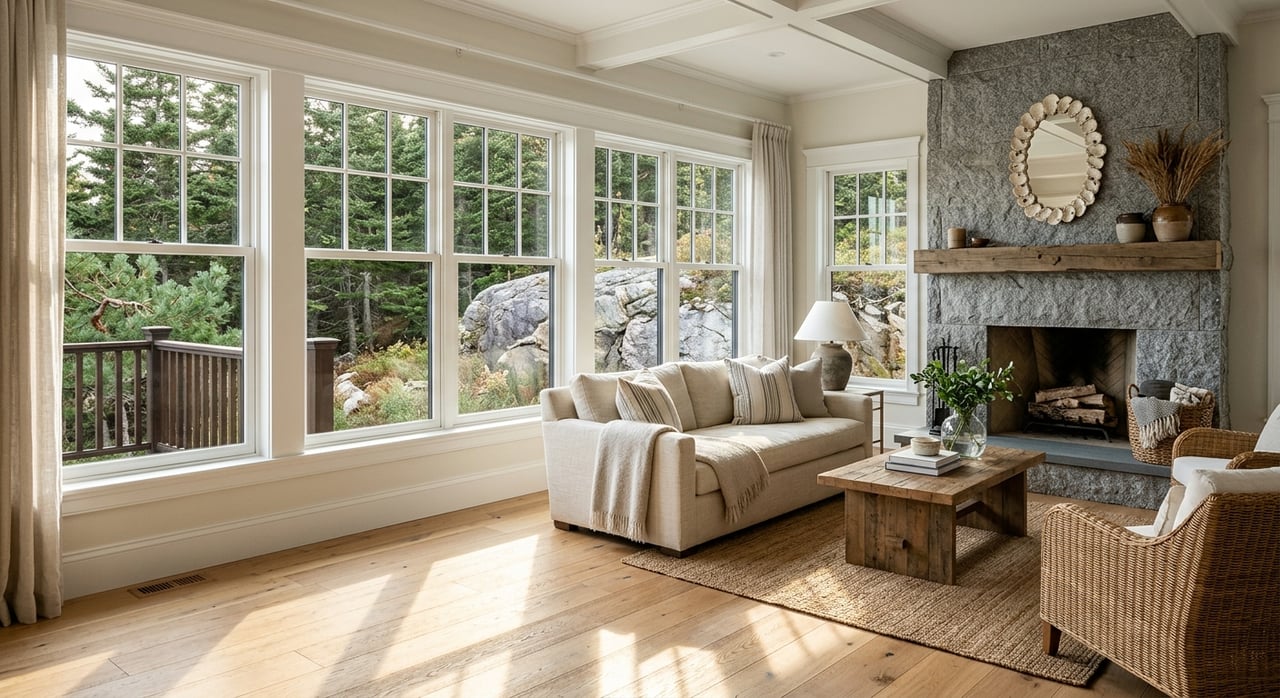
Neutrals provide a sense of calm and flexibility, serving as a foundation for other colors or standing alone for a clean, minimalist effect. White, beige, and various shades of gray allow you to personalize a space with changing accessories, making them a great choice if you like to update your décor seasonally.
Neutrals also help rooms feel larger and brighter. They reflect natural light well and can be combined with bolder accents for a dynamic look. Mixing different neutral tones and textures—think a beige sofa with gray pillows or a white wall paired with natural wood—adds depth and sophistication.
These colors are a safe bet for larger surfaces, like walls or flooring, especially in open-concept homes where continuity is important. They also make it easy to showcase art, furniture, or colorful accents.
Ways to Use Neutrals
-
Paint walls in soft grays or off-whites for a timeless backdrop.
-
Choose neutral furniture for versatility as your style evolves.
-
Layer different textures—such as linen, wood, and stone—to create interest.
Considering Light and Space
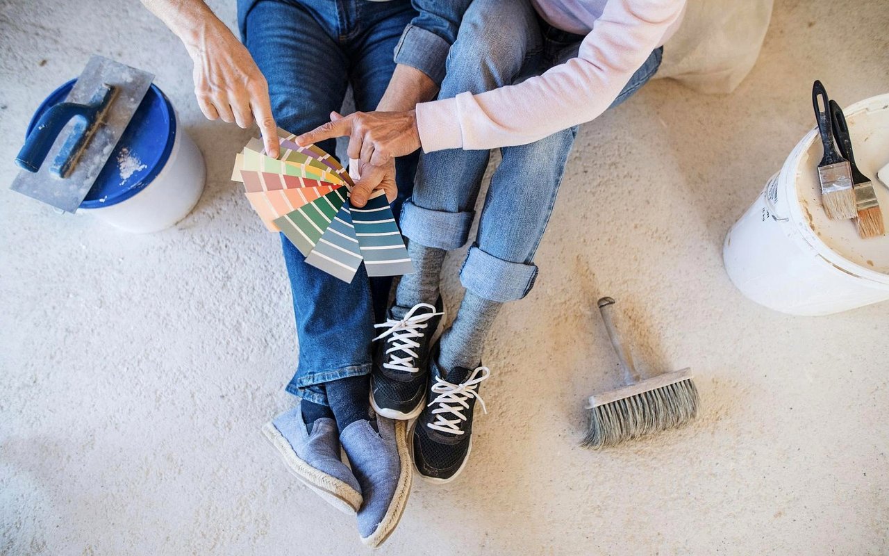
Natural and artificial lighting have a major impact on how colors appear. A paint color might look completely different under morning sun than it does under warm evening light or artificial bulbs. This is why it’s important to test paint swatches on your walls at different times of day before making a final decision.
Lighter colors reflect more light, making compact rooms feel bigger and brighter. Darker colors can add drama, especially in large spaces or rooms that receive plenty of natural light. Using mirrors and metallic accents can help maximize the effect of light in a room, enhancing your color choices.
The orientation of a room also plays a role in how a color appears. North-facing rooms receive cooler, indirect light, which can make colors feel more subdued. Meanwhile, south-facing spaces receive warm light, bringing out the best in deeper, richer tones.
Lighting and Color Tips
-
Test paint swatches on your wall in different lighting conditions.
-
Use lighter shades to open up small or dark rooms.
-
Combine mirrors and reflective accents with your chosen colors for a brighter look.
FAQs
What Is Color Psychology, and How Does It Affect My Home?
Color psychology studies how colors influence mood and behavior. In your home, different colors can create feelings of calm, energy, optimism, or comfort based on their psychological associations.
Which Colors Are Best for Small Spaces?
Lighter colors, such as whites, soft grays, or pastels, reflect light, making small rooms feel more open. Adding mirrors and reflective décor also helps create a sense of spaciousness.
How Can I Use Color Without Repainting?
Try using colorful accent pieces like pillows, rugs, and art. Accent walls, removable wallpaper, and decorative accessories are easy ways to add color and update your space without repainting the entire room.
How Do I Choose Colors That Work Together?
Stick to a main color and one or two accent colors for each room. Consider using the color wheel for inspiration or choosing shades within the same color group for a cohesive look. Take time to sample and test combinations before making a final decision.
Bring Your Home to Life
If you’re ready to see real change in your home, start with color. Whether you’re after energy, calm, or pure comfort, the right colors will help you achieve your goals without a major overhaul. Take your time, experiment with accents, and trust your instincts; your home can be a true reflection of your personality and aspirations.
When it comes to buying or selling real estate in Bar Harbor, ME, you deserve a dedicated guide who understands the market inside and out. If you’re looking for trusted advice, exceptional service, and results that match your goals, it’s time to connect with me, Steve Shelton. Let’s make your next move in Bar Harbor a smooth, rewarding experience from start to finish.
When it comes to buying or selling real estate in Bar Harbor, ME, you deserve a dedicated guide who understands the market inside and out. If you’re looking for trusted advice, exceptional service, and results that match your goals, it’s time to connect with me, Steve Shelton. Let’s make your next move in Bar Harbor a smooth, rewarding experience from start to finish.